

QuikTrip
Turning a Static Website into a Living Brand Experience
Helping QuikTrip own their digital voice with a scalable, accessible, mobile-first website.
Visit QuikTrip

My Work
About Me
Resume
Deliverables
Full Website Redesign
WCAG-Compliant Responsive UI
My Role
Lead UX/UI Designer
Lead UX Strategist
Team
Product Manager
Web Developers
Tools
Sketch
Photoshop
Duration
6+ Months
THE CHALLENGE
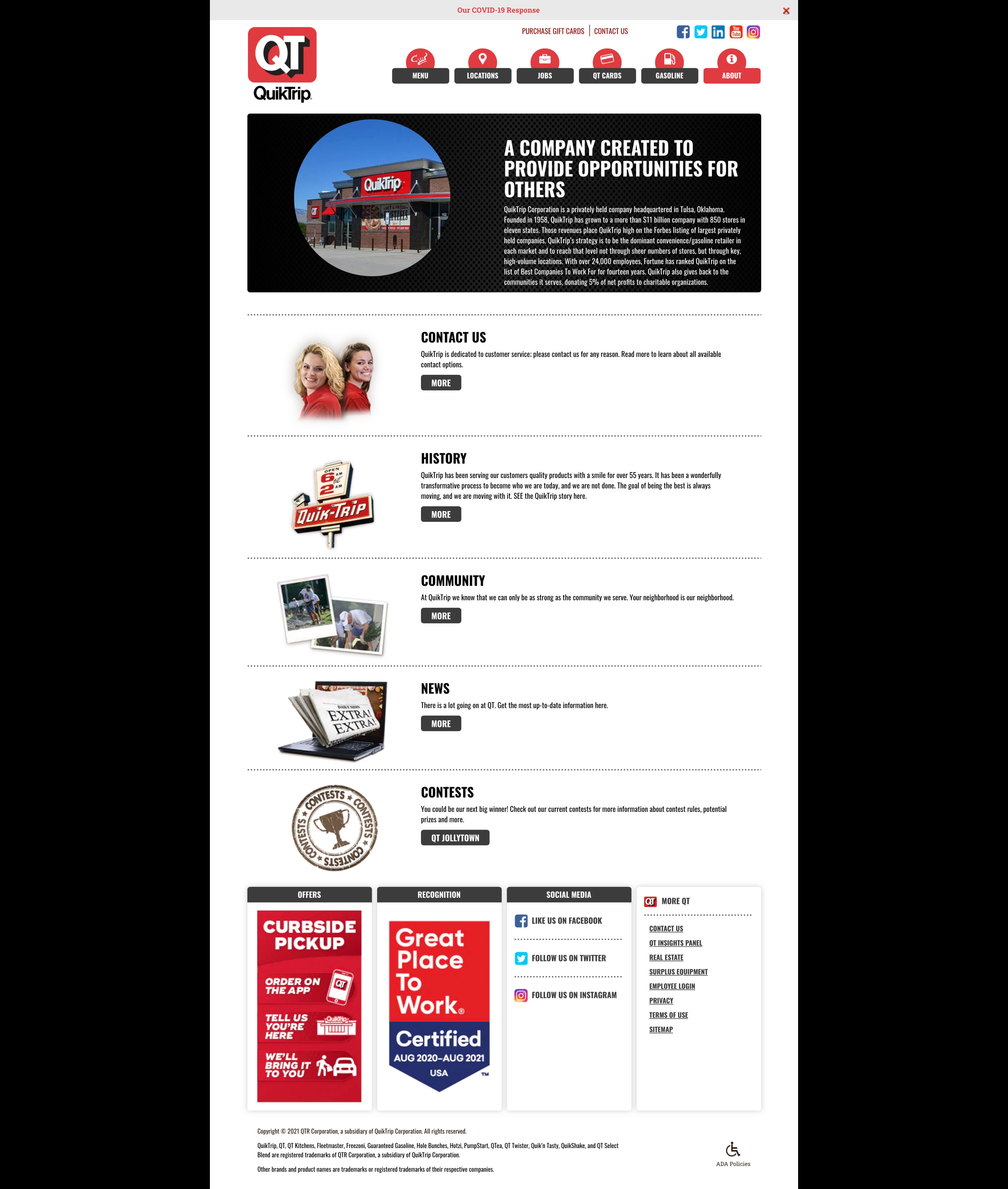
When the Website Didn’t Reflect the Brand
The client's original site was compartmentalized, inaccessible, and hard to maintain. Key challenges included:
No mobile optimization, resulting in unresponsive website experience
An outdated and mostly static design that didn't reflect QuikTrip’s modern in-store experience
An overly simplified navigation structure that buried important links and made it difficult for users to find what they were looking for
A lack of engaging visuals, images, and videos, which weakened brand storytelling and user engagement
Numerous broken or outdated links, giving the impression of a neglected site
They needed a design and CMS solution that was flexible, scalable, and easy to use without sacrificing visual impact.

OVERVIEW
Redefining the Digital Storefront
QuikTrip is a nationwide brand with a strong retail presence, but they were losing online engagement due to a dated, fragmented website experience. Their site didn’t reflect the vibrancy of their in-store service and lacked mobile optimization, accessibility, and modern content management capabilities.
As part of a small, agile team at Fahrenheit Marketing, I led the end-to-end redesign effort, from stakeholder discovery to mobile-first UI design, aiming to give them a functioning and clean website experience that would improve their customer engagement.
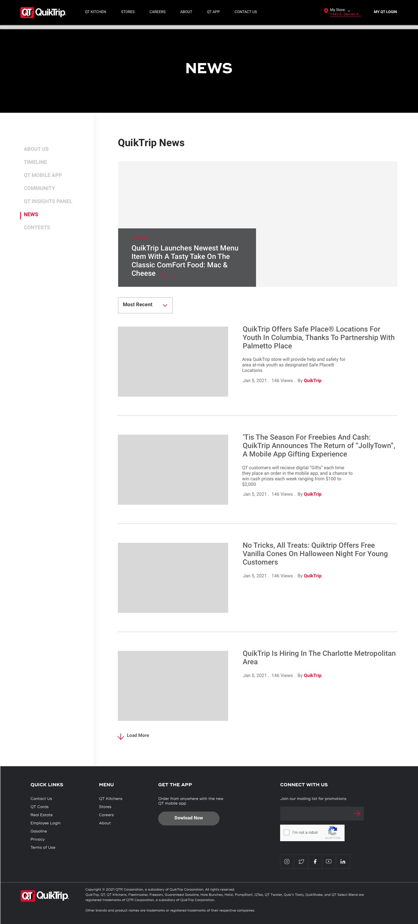
RESEARCH & DISCOVERY
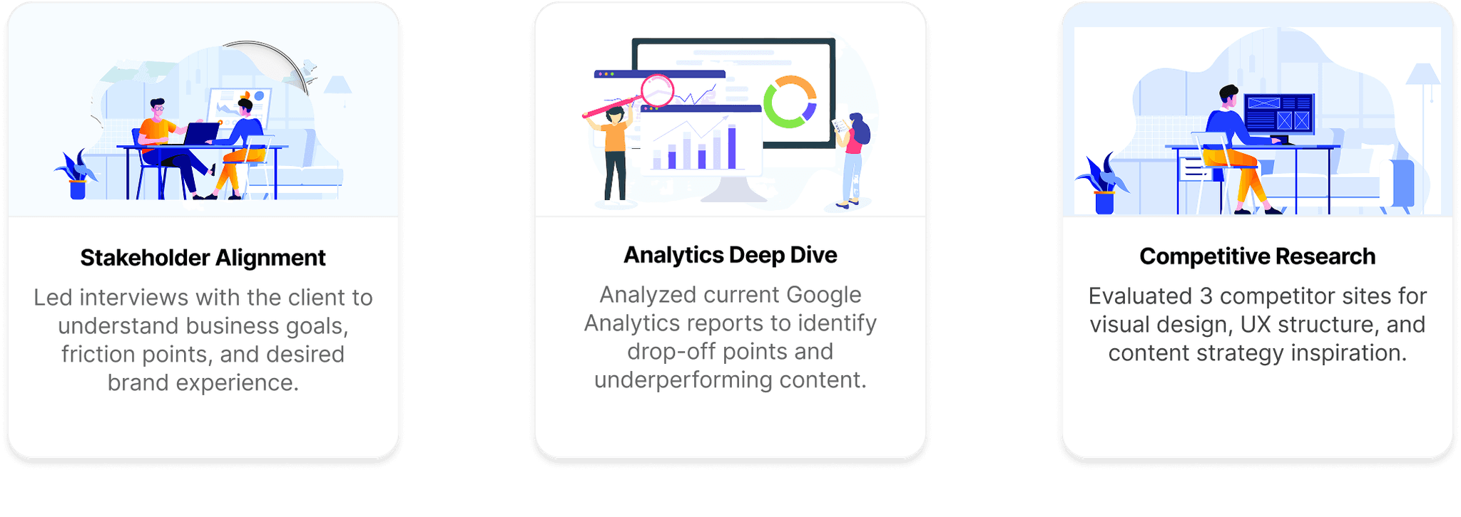
Building on Insights
Before making any design decisions, I focused on understanding the client’s needs, user behavior, and the competitive landscape to ensure our approach was grounded in real data and strategic alignment.
DESIGN PROCESS
Laying the Foundation
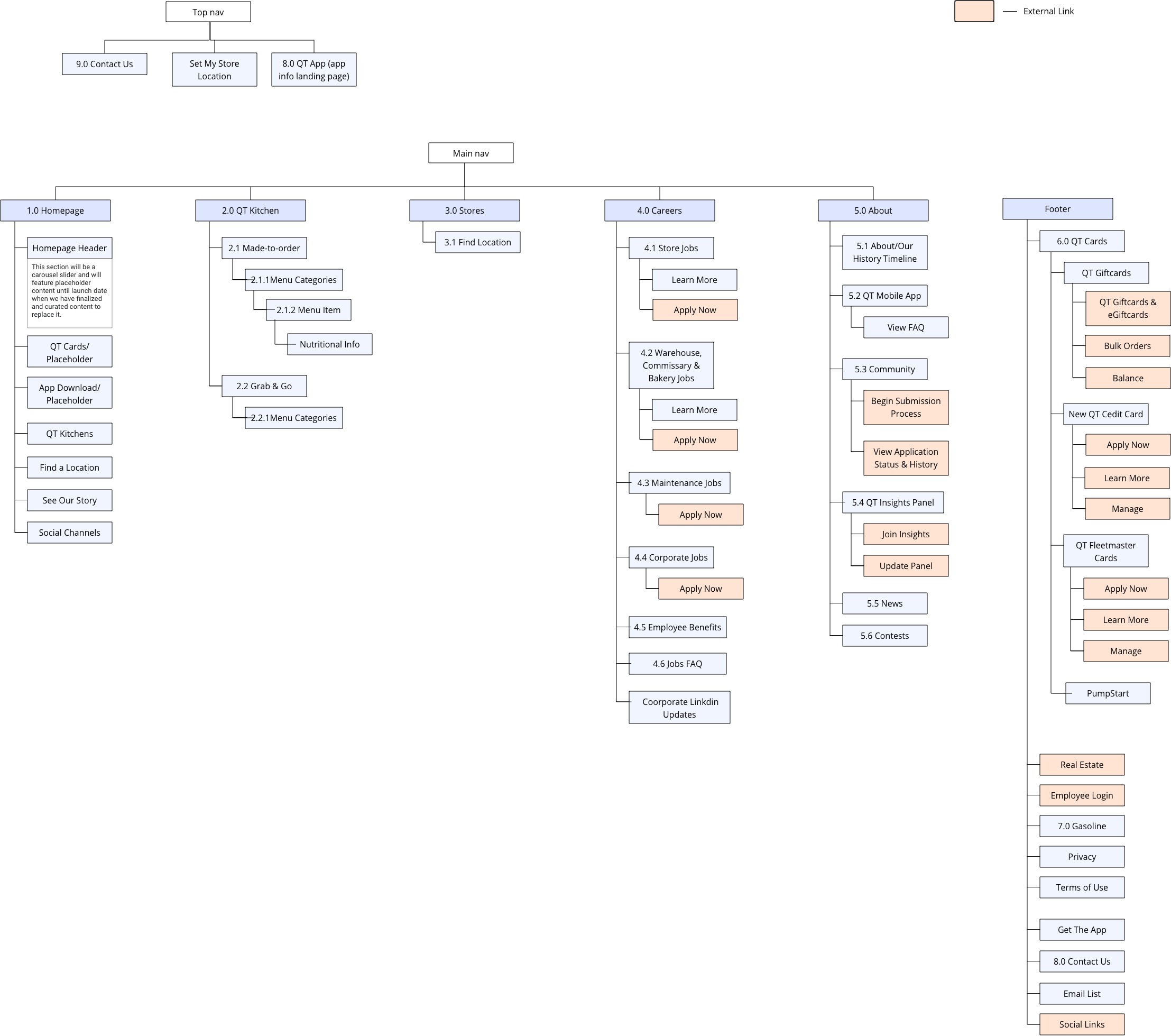
Before jumping into design, I took a strategic approach informed by my research and stakeholder needs. Based on the challenges we uncovered from the existing site, insights from Google Analytics on user behavior, and the client’s vision for a clean, modern brand experience, I began by mapping the current site structure. I created a comprehensive sitemap to analyze layout, page hierarchy, content distribution, and identify dead or external links. This helped determine which content was essential, which pages could be merged, and what could be removed entirely to streamline the user experience and reduce friction.
I then presented these recommendations to the client, incorporated their feedback, and received approval before moving forward into wireframing and design.
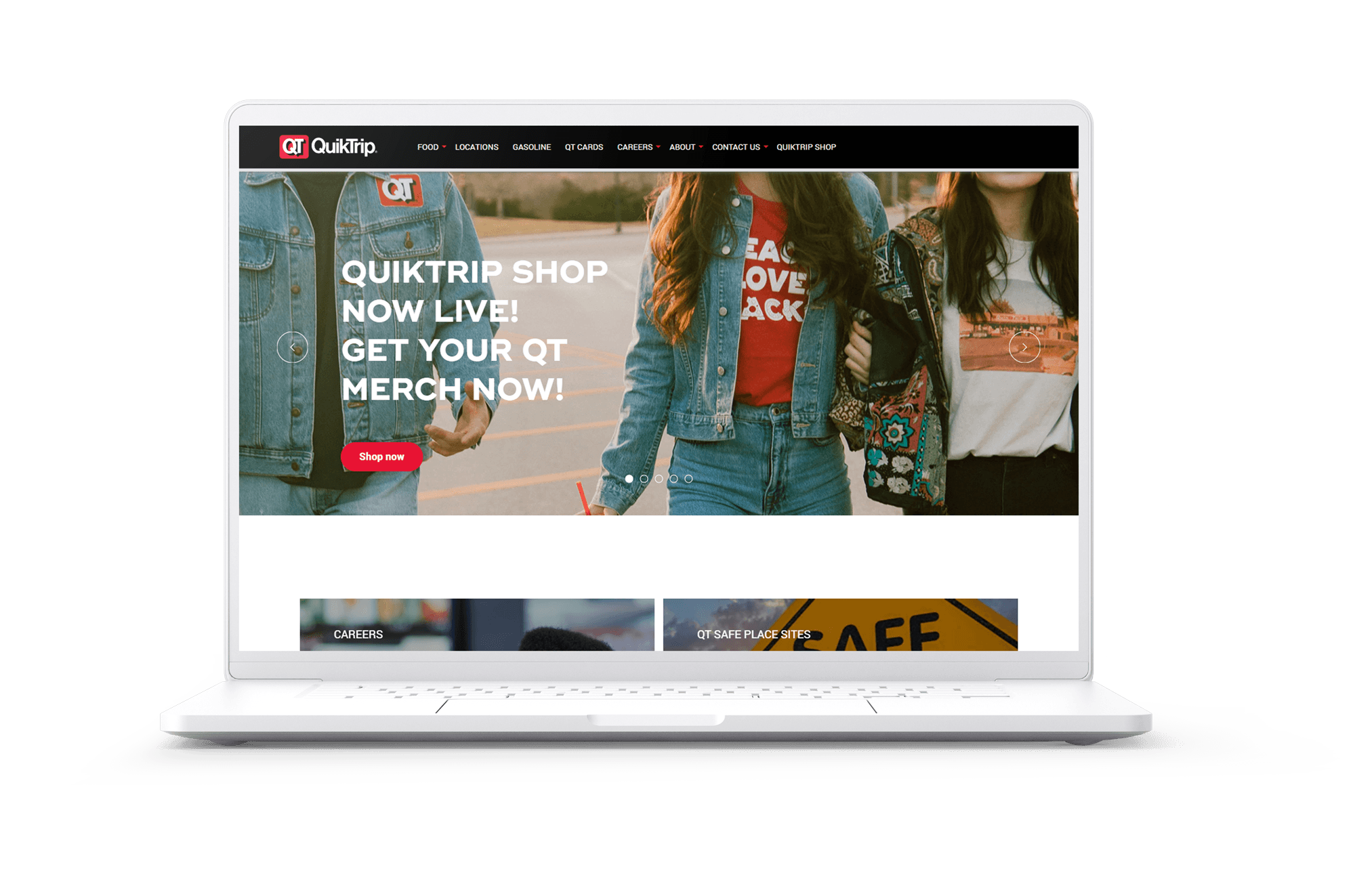
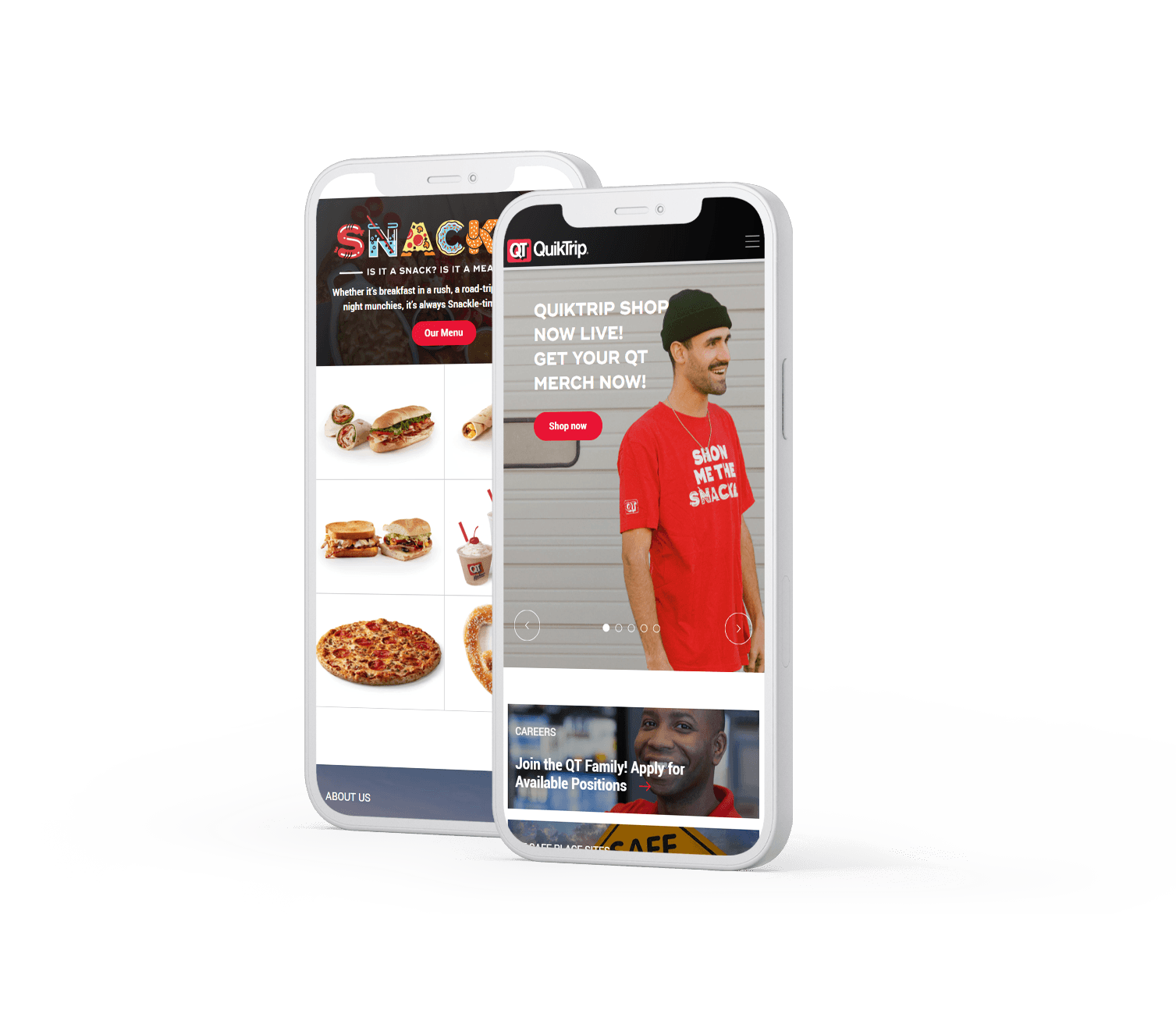
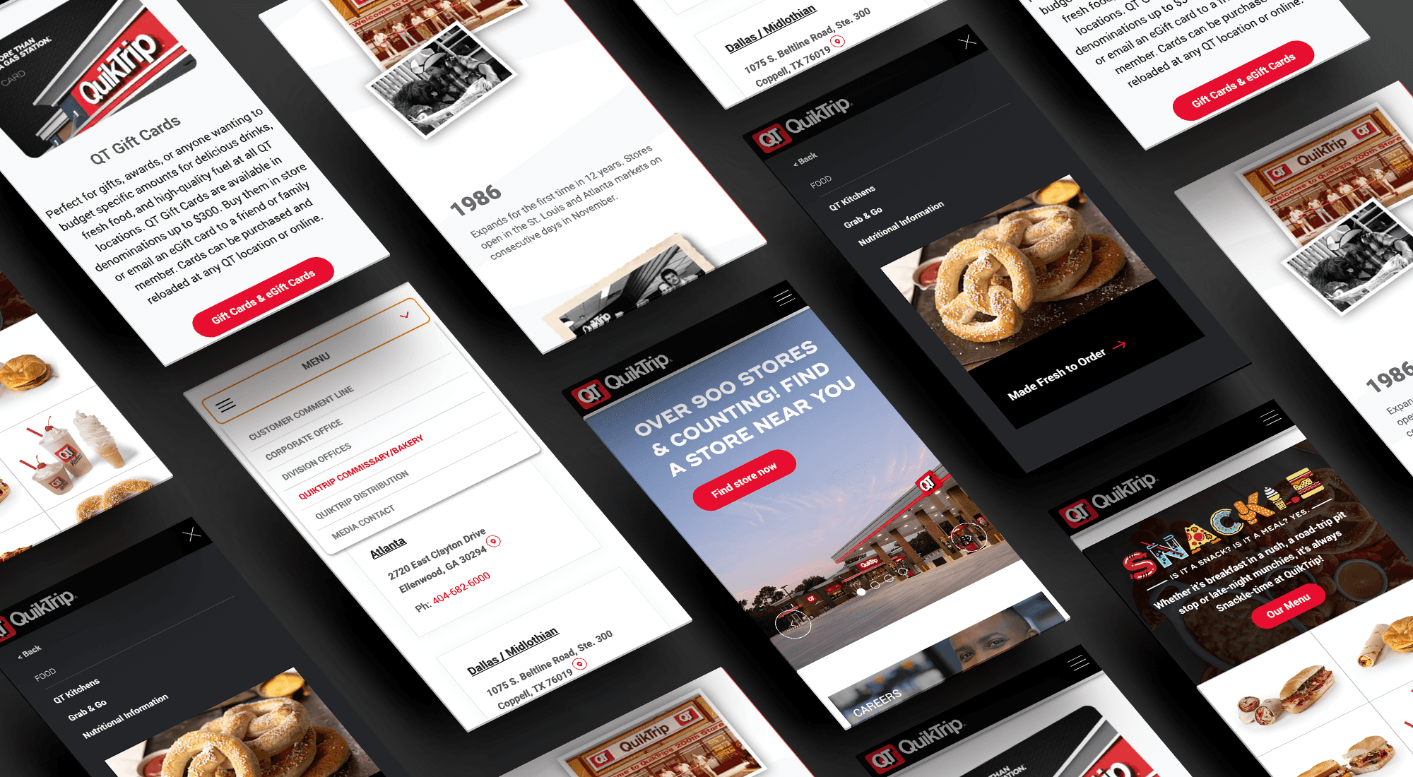
With the new site architecture approved, I developed mobile-first wireframes in Sketch, prioritizing clarity of navigation and content discoverability across devices. I designed interactive mockups to demonstrate responsive behavior and collaborated closely with the client through multiple iterations to ensure the new look and feel aligned with their brand vision.
To support scalability and maintain consistency, I created reusable components and layout templates, and established a WCAG AA–compliant design system including a color palette, accessible text styles, and contrast standards. I also delivered a mini style guide to support future visual consistency.
Throughout the process, I conducted design reviews with the client team (QT), sharing prototypes, collecting feedback, and iterating frequently. To elevate the visual quality of the final product, I also recommended that the client update and unify their imagery, ensuring that high-quality, consistent photography contributed to a clean and cohesive look across the site.
FEATURE HIGHLIGHTS
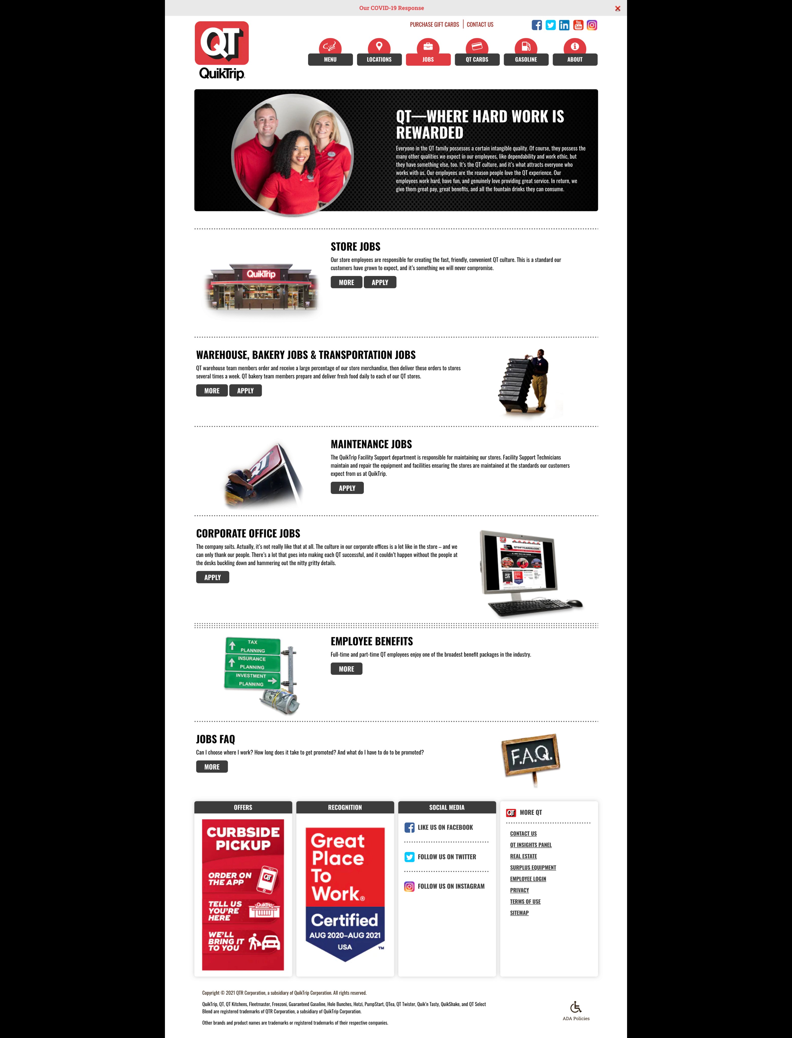
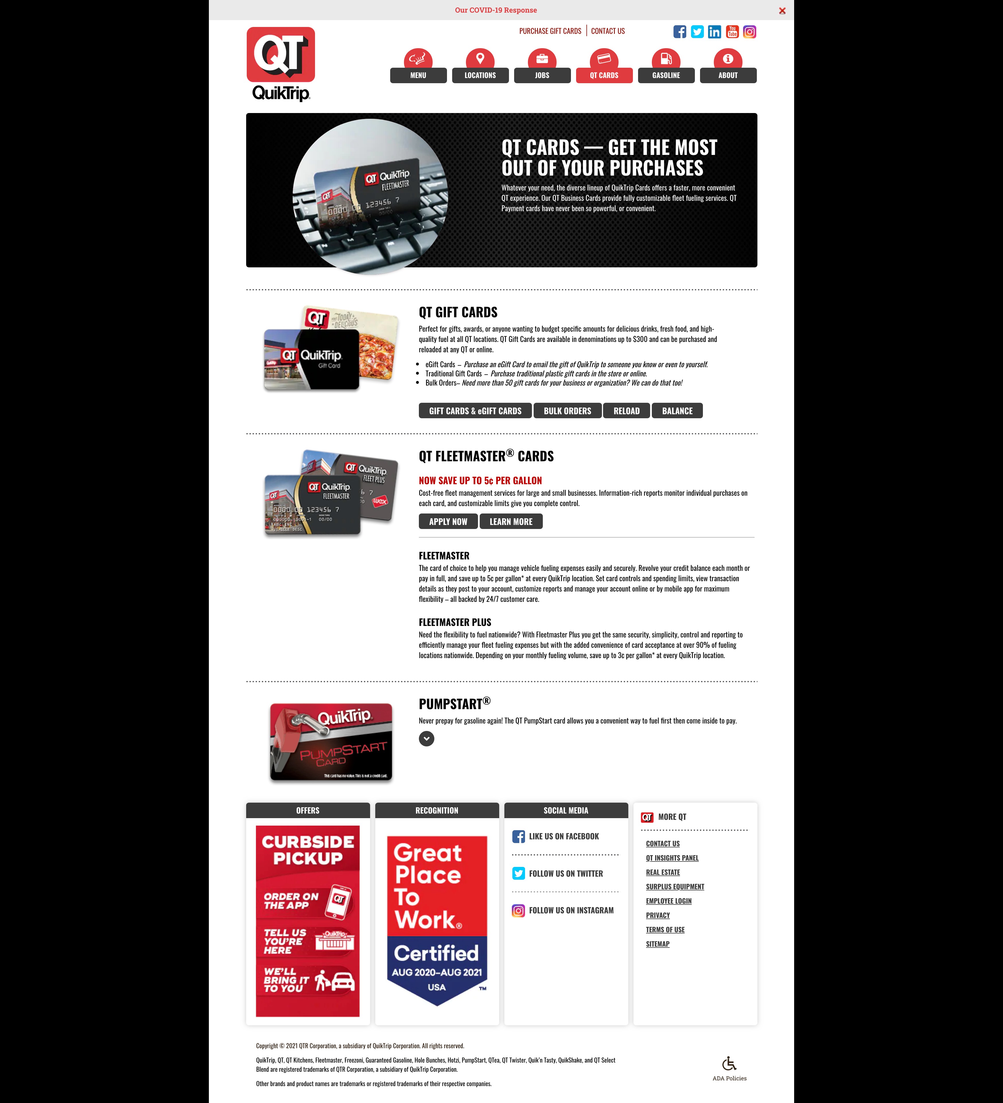
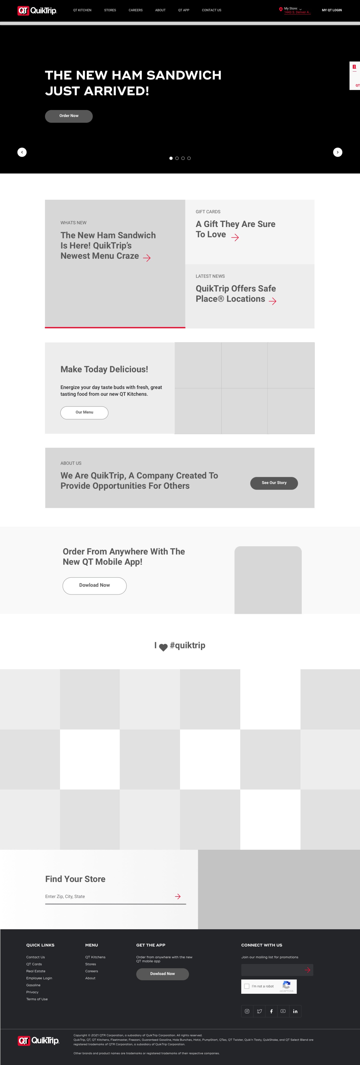
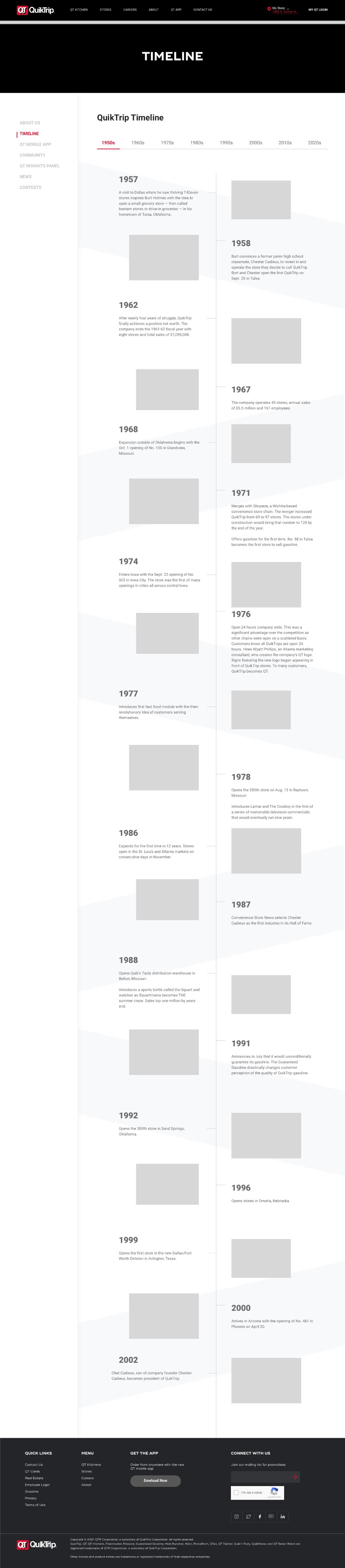
Enhancing Discoverability Through Navigation
I restructured the site’s main navigation by consolidating key pages into eight clear, top-level links in the header. Relevant supporting content was organized into intuitive dropdown menus, allowing users to easily explore all submenu items without leaving the homepage.
This redesign significantly improved content discoverability, replacing the previous five-link navigation that hid important pages unless users landed on them directly. The new structure enables faster access to information, a more seamless browsing experience, and a stronger sense of orientation across both desktop and mobile.


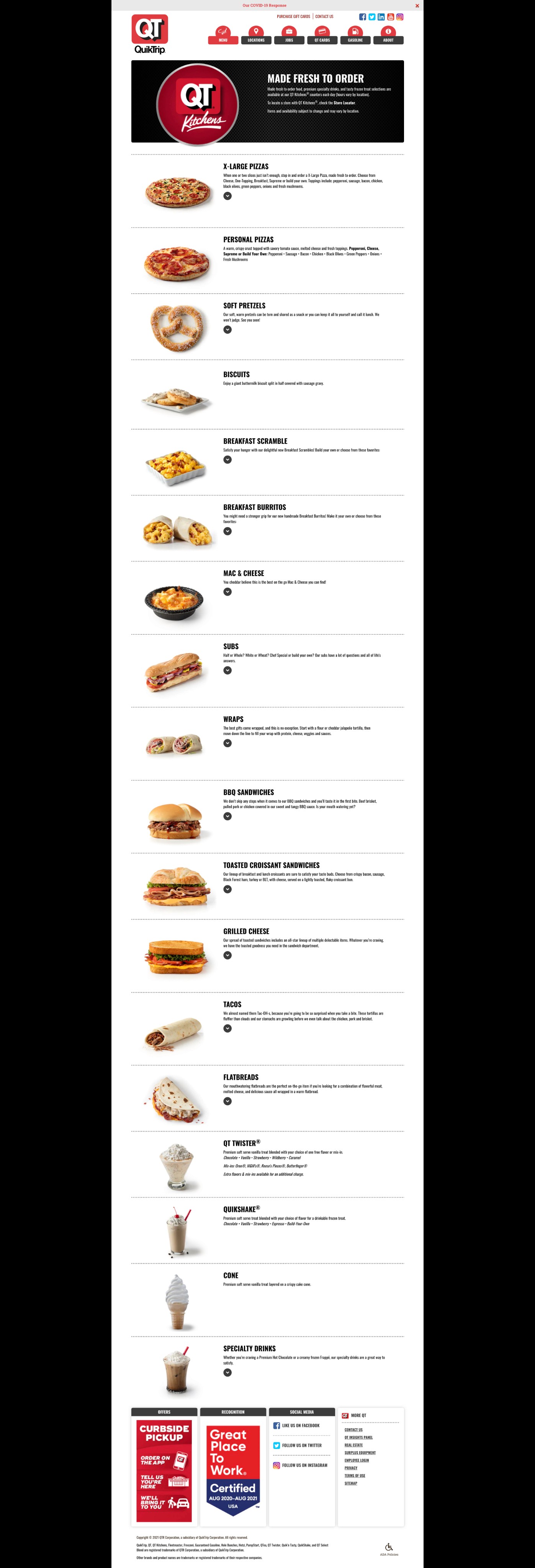
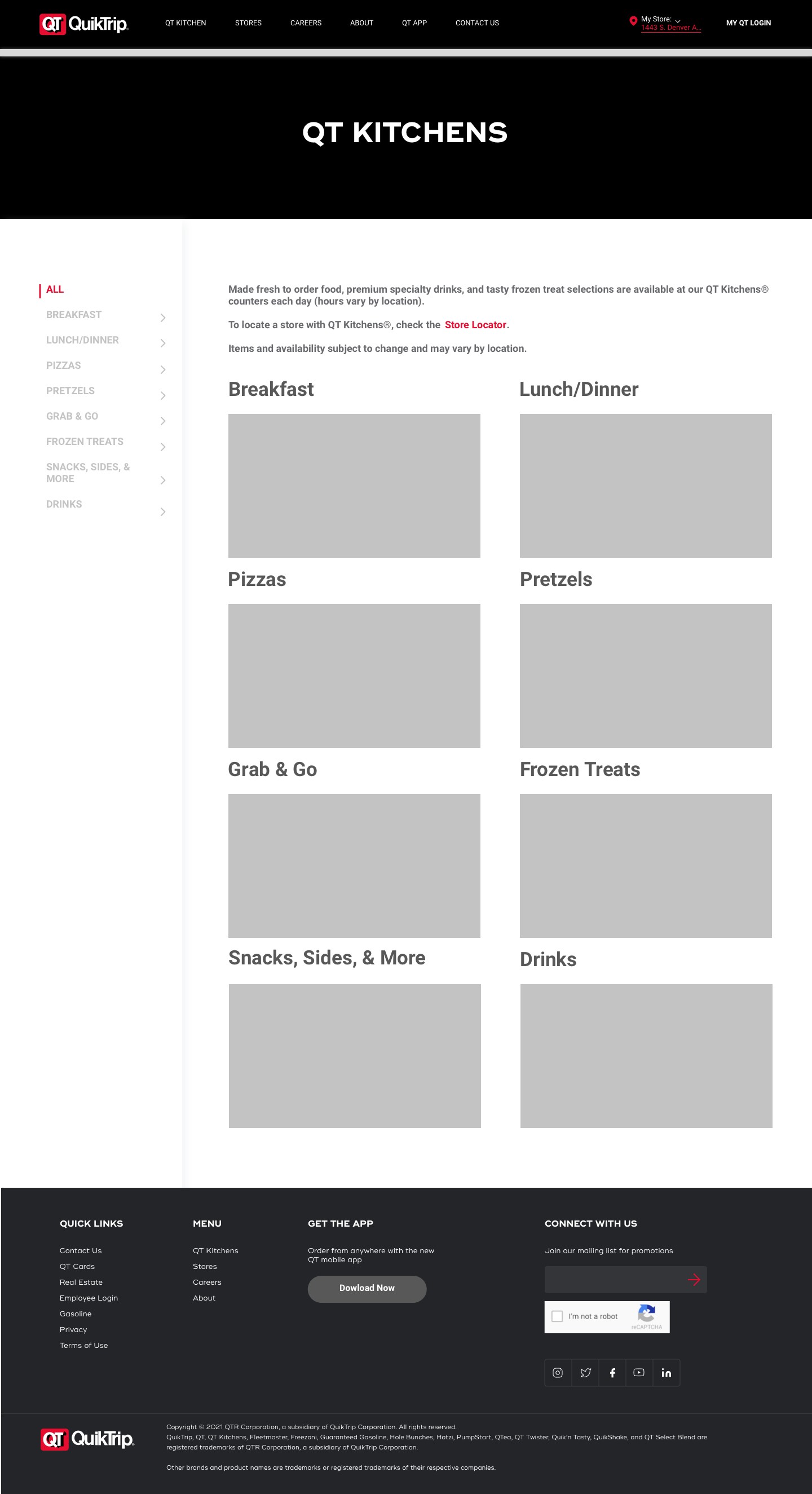
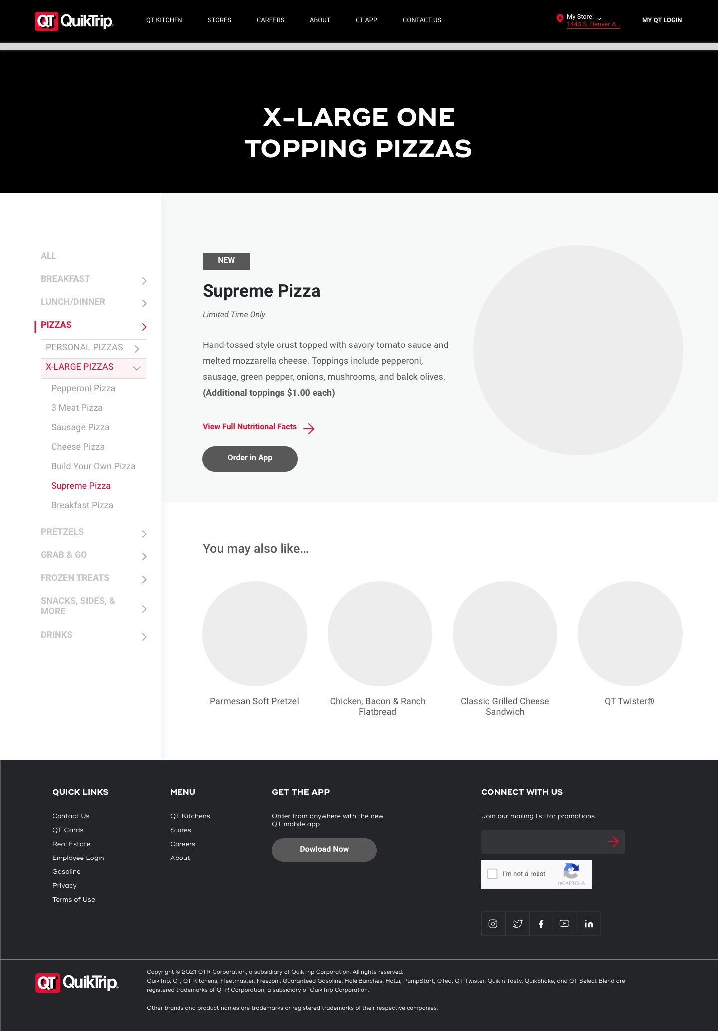
Organizing the Menu Experience
To support the complex structure of the client’s in-store product offerings, I designed a nested side navigation system specifically for the Menu page. This allowed users to easily browse multi-tiered categories and subcategories, such as drinks, sandwiches, snacks, and specialty items—without feeling overwhelmed.
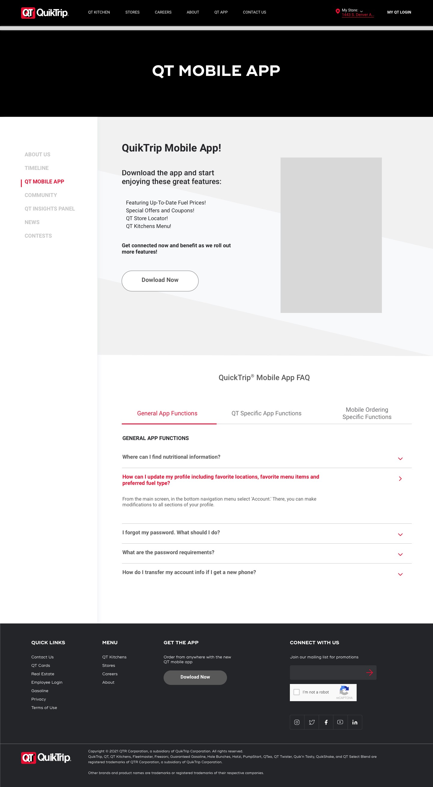
Each item page also includes a QR code, as requested by the client, to encourage app downloads and enable users to pre-order directly from their phones.
To further boost engagement, I implemented a "You may also like..." section beneath each item, showcasing related products and prompting users to continue exploring the menu.


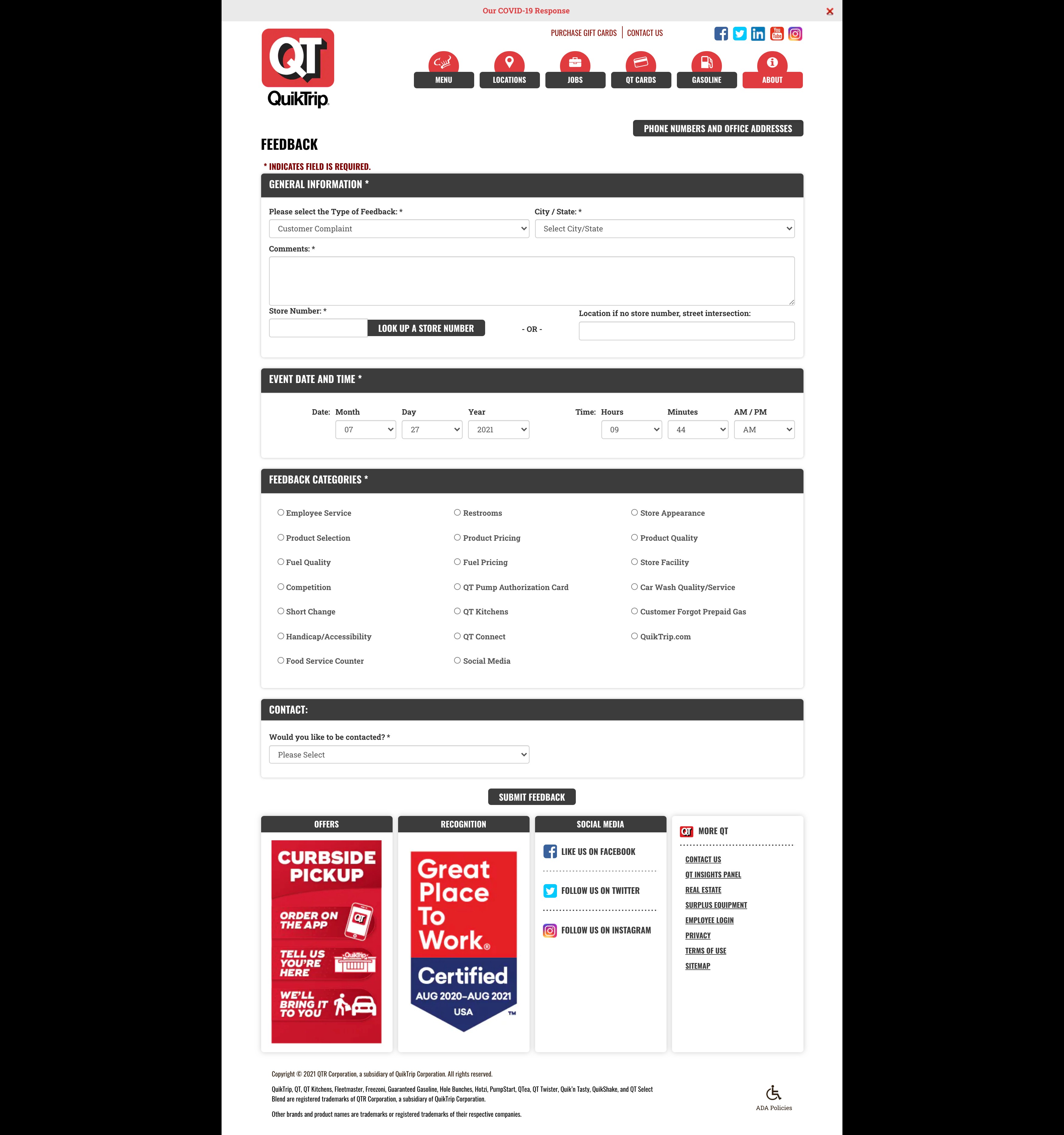
Easy Filtering
On the Division Offices contact page, I introduced a set of interactive filter tag buttons at the top of the page—one for each state. Instead of scrolling through a long list of contacts, users can now simply click on a state button to instantly filter the content and view relevant office locations and phone numbers. This feature dramatically improves efficiency and ease of use, especially for mobile users or those looking for quick access to regional support.


STRATEGY & HANDOFF
???
As we neared launch, our focus shifted to ensuring long-term scalability, usability, and client ownership. Our strategy wasn’t just to ship a polished product — it was to empower the client with a sustainable toolset and clear processes, so the site would continue to evolve and perform long after launch.
Collaborated with developers to customize Elementor for WordPress, a flexible CMS that’s easy for non-technical users to manage.
Custom CMS Configuration

Delivered custom walkthroughs and video tutorials to help the client confidently manage content updates, layout changes, and media uploads without relying on a dev team.
Team Enablement

Performed QA testing across devices and browsers. Ensured the site met WCAG AA accessibility standards.
Post-Launch QA & Accessibility Checks

30%
Improvement in conversion rate
65%
Avg. time on site
20%
Decrease in
bounce rate
30%
Improvement in conversion rate
65%
Avg. time on site
20%
Decrease in
bounce rate
RESULTS
Enhancing Discoverability Through Navigation
I restructured the site’s main navigation by consolidating key pages into eight clear, top-level links in the header. Relevant supporting content was organized into intuitive dropdown menus, allowing users to easily explore all submenu items without leaving the homepage.
This redesign significantly improved content discoverability, replacing the previous five-link navigation that hid important pages unless users landed on them directly. The new structure enables faster access to information, a more seamless browsing experience, and a stronger sense of orientation across both desktop and mobile.
Overview
The Challenge
Research & Discovery
Design Process
Strategy & Hand-Off
Results